Overview
Project Vanguard redefined the visual and interaction language for CBS Sports and established a shared system foundation designed to scale across platforms.
The work focused on translating broadcast energy into reusable patterns while resolving fragmentation across mobile, web, and CTV.
A Living System for a New Generation
Vanguard began with a clear challenge: serve the modern sports fan better. Our goal was to translate the energy and personality of live sports into a digital system that feels immediate, vibrant, and immersive across every surface. While visually expressive, the work also addressed deeper fragmentation in interaction patterns that slowed implementation and cross-platform consistency.
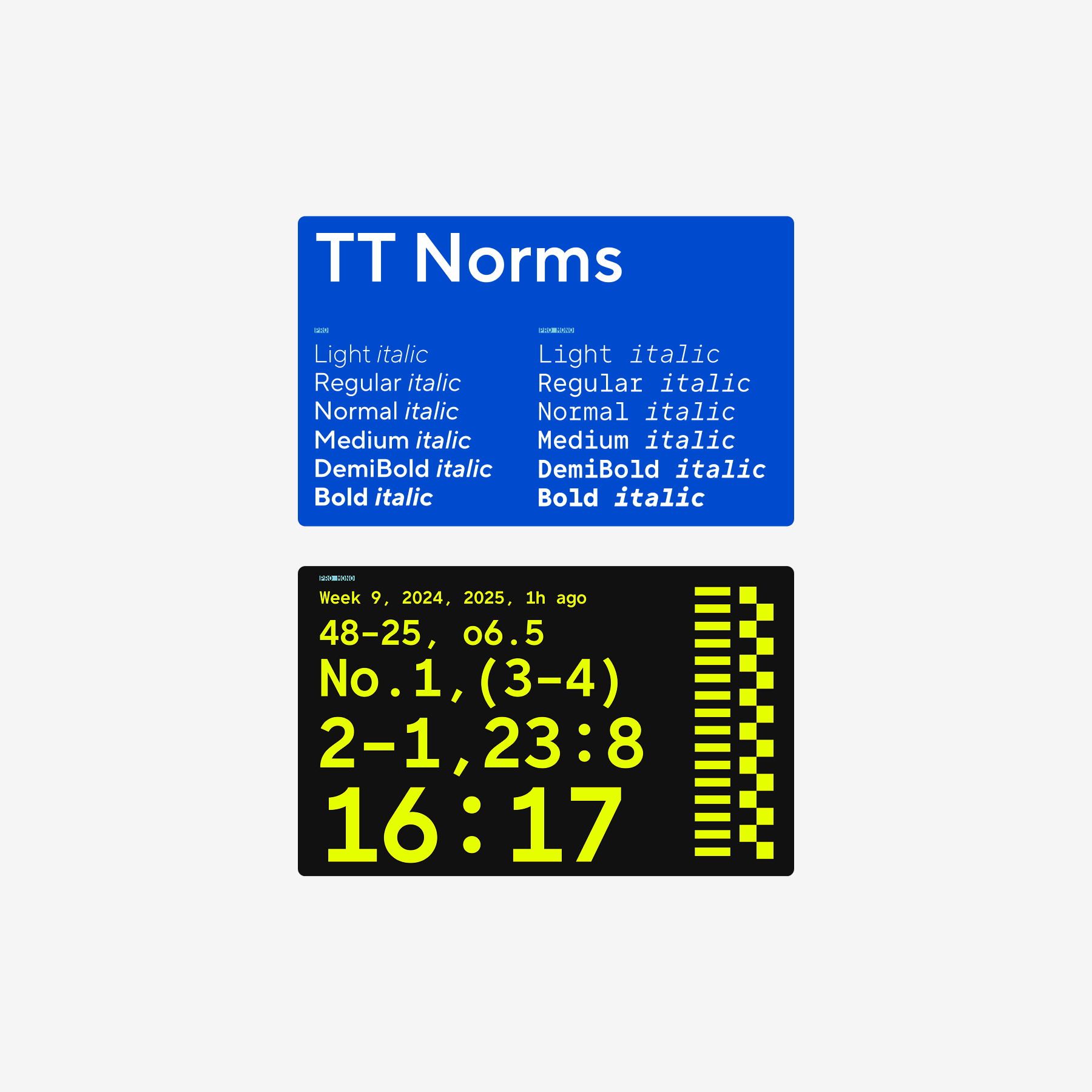
Typography Explorations
Exploring type families that could carry Vanguard’s voice while remaining performant and legible across high-density sports data led us to TT Norms, paired with TT Norms Mono for numerical data, bringing clarity and rhythm to scores, stats, and tables.
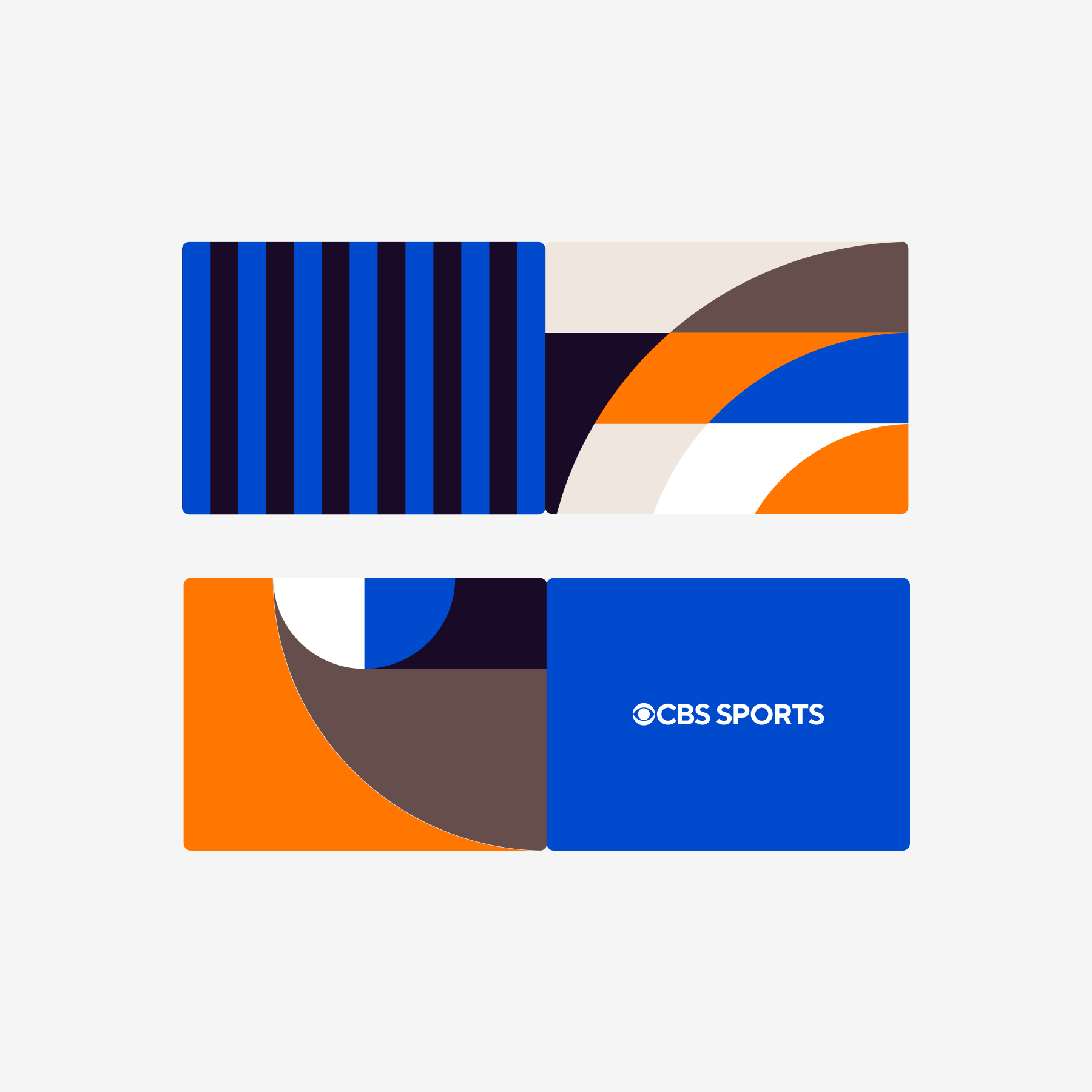
Color & Pattern Studies
Early tests pushed into bolder colors and energetic patterns to understand how far the CBS identity could stretch while still feeling anchored and recognizable.
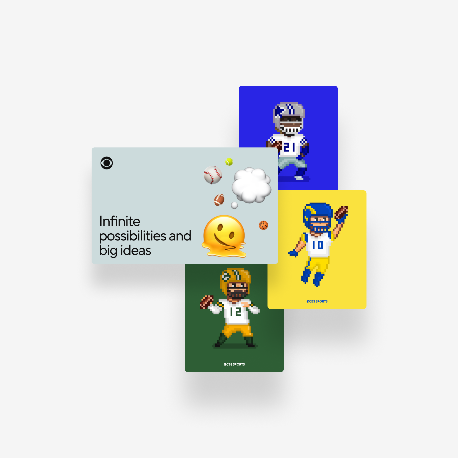
Retro Vibrancy Experiments
Playful 16-bit illustration explorations introduced a youthful, expressive layer — blending nostalgia with a fresh energy tailored for modern fans.
Early Application Tests
Applying illustration concepts to real components helped evaluate how younger visual expressions might coexist with CBS's established tone.
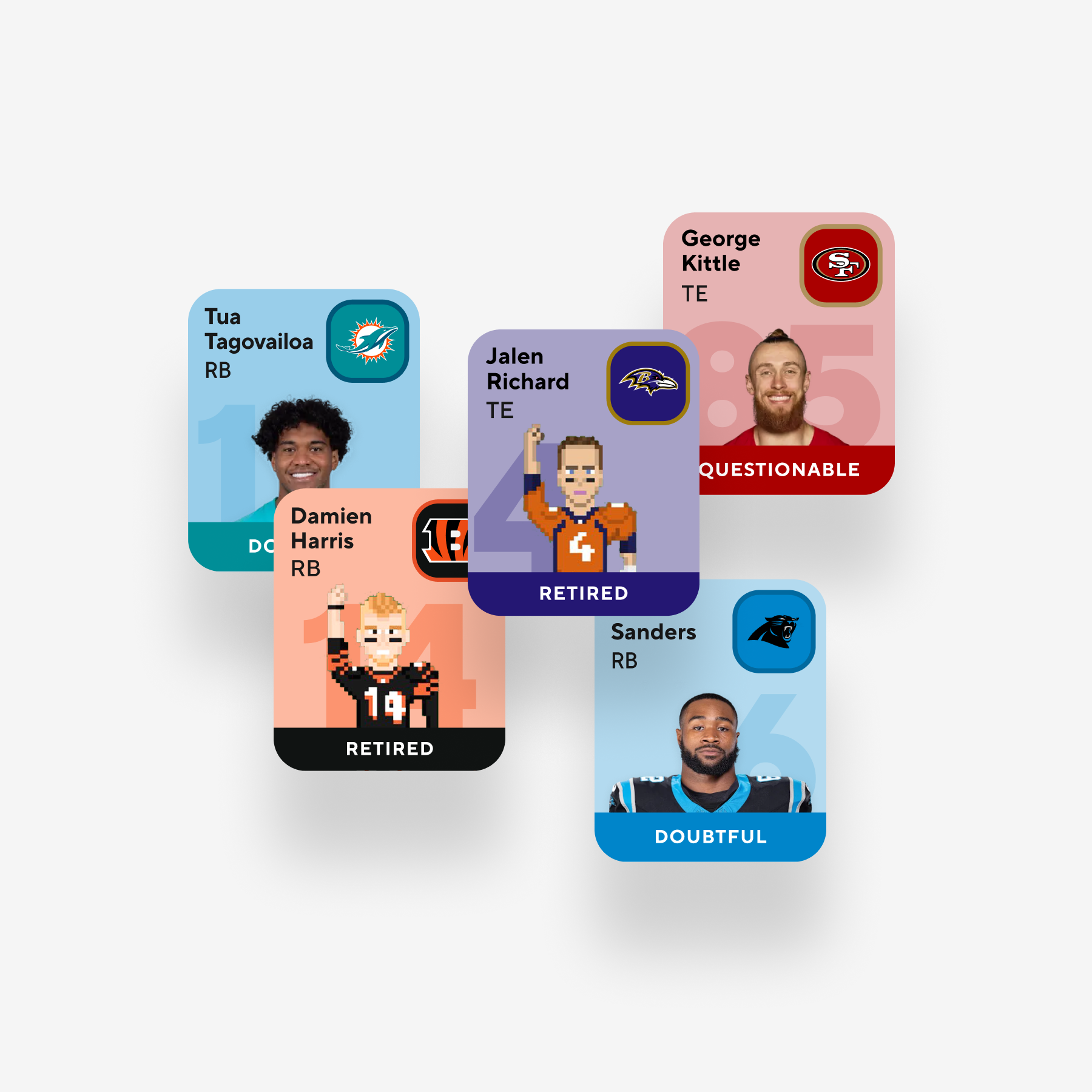
Team-Driven Color Play
Team-based color experiments explored how vibrant palettes could heighten fandom energy and transform matchups into dynamic, emotionally charged moments.
The Challenge
CBS's digital ecosystem had grown fragmented — visually, technically, and tonally. Products evolved independently, making it difficult to scale features or innovate quickly.
Vanguard set out to define shared rules and reusable components so teams could rely on common patterns instead of repeatedly solving the same interaction problems.
Design Philosophy
Vanguard was designed to feel alive without becoming noisy — expressive, confident, and controlled. Every decision was grounded in clarity, restraint, and a deep respect for the rhythms of live sports.
Motion Principles
When CBS Sports moves, it moves like a team in sync.
Disciplined
Motion is intentional and precise. No wasted movement. Every beat lands on tempo.
Unified
Elements move together, reinforcing hierarchy and continuity across moments.
Propulsive
Motion carries energy forward — snapping, bouncing, and accelerating with athletic confidence.
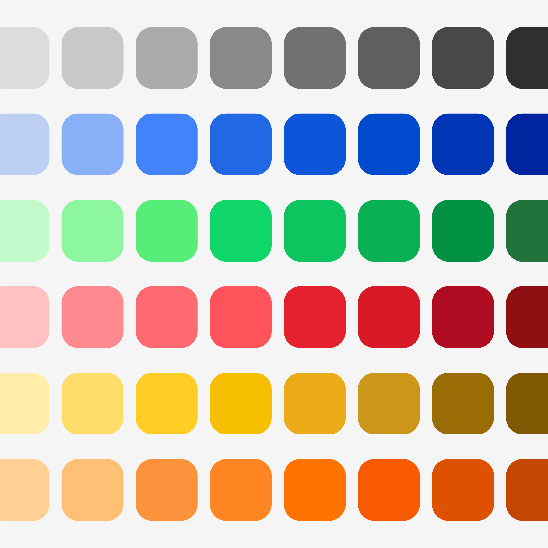
Color System
A more vibrant palette brought life and emotional resonance to the system while remaining grounded in CBS's core color family.
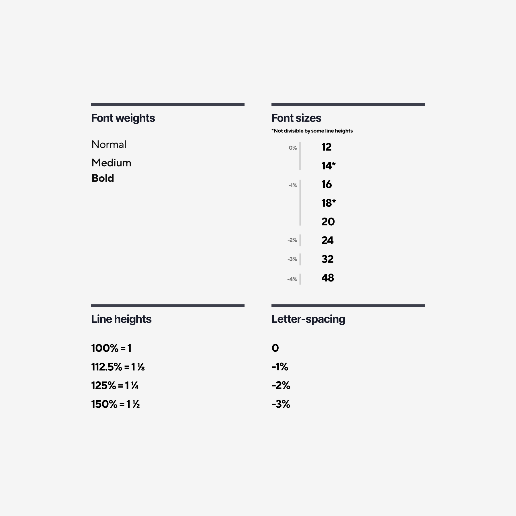
Typography System
We refined the type scale to just three essential weights, adjusted spacing, and created a unified typographic foundation that performs seamlessly across web, mobile, and CTV.
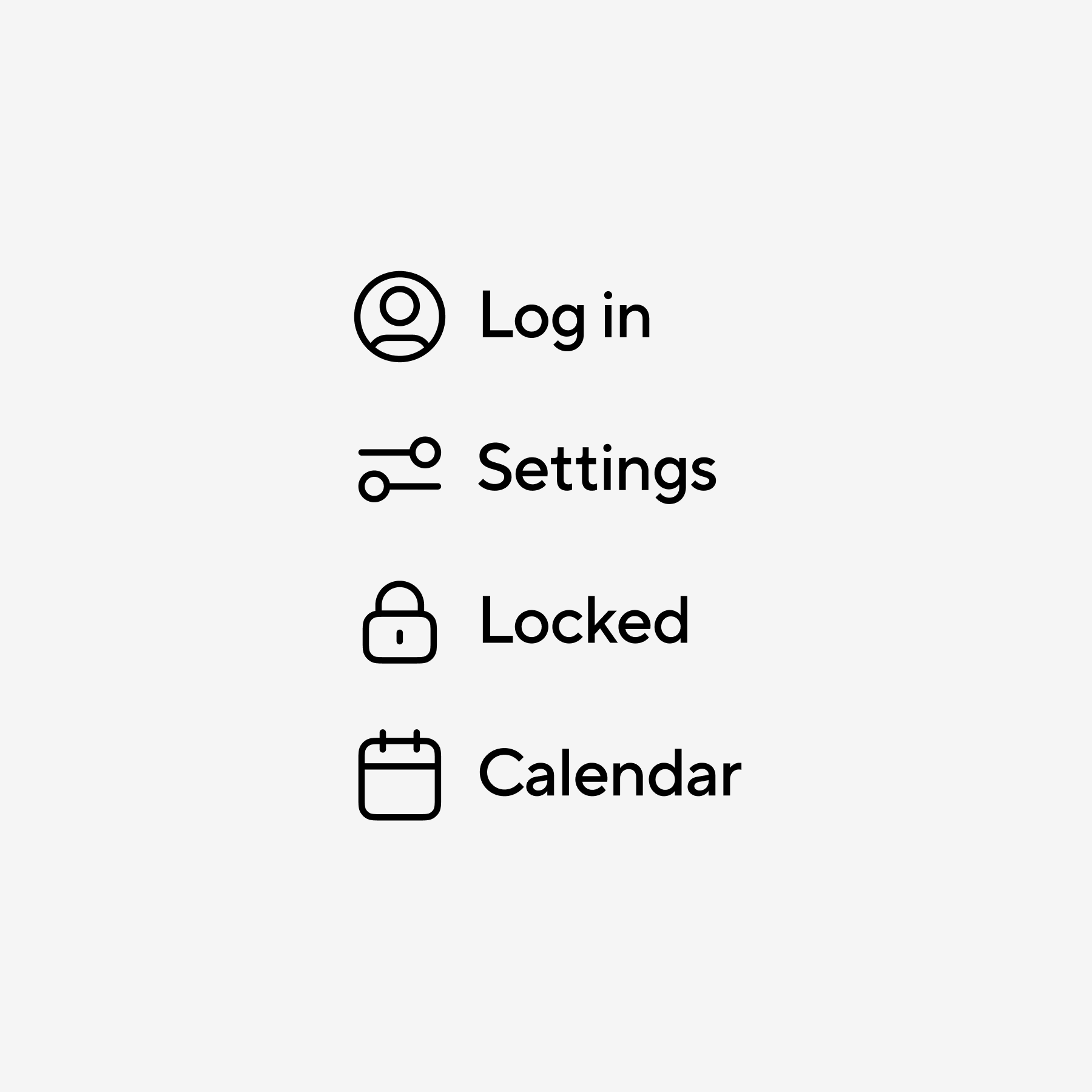
Icon System
After evaluating multiple icon families, we defined a versatile set aligned to TT Norms — modern, approachable, and flexible enough to extend across Sports, News, and Entertainment.
Icon & Type Pairing
Systematic tests examined weight, corner radius, and proportions to ensure icons and typography felt aligned, balanced, and confidently expressive.
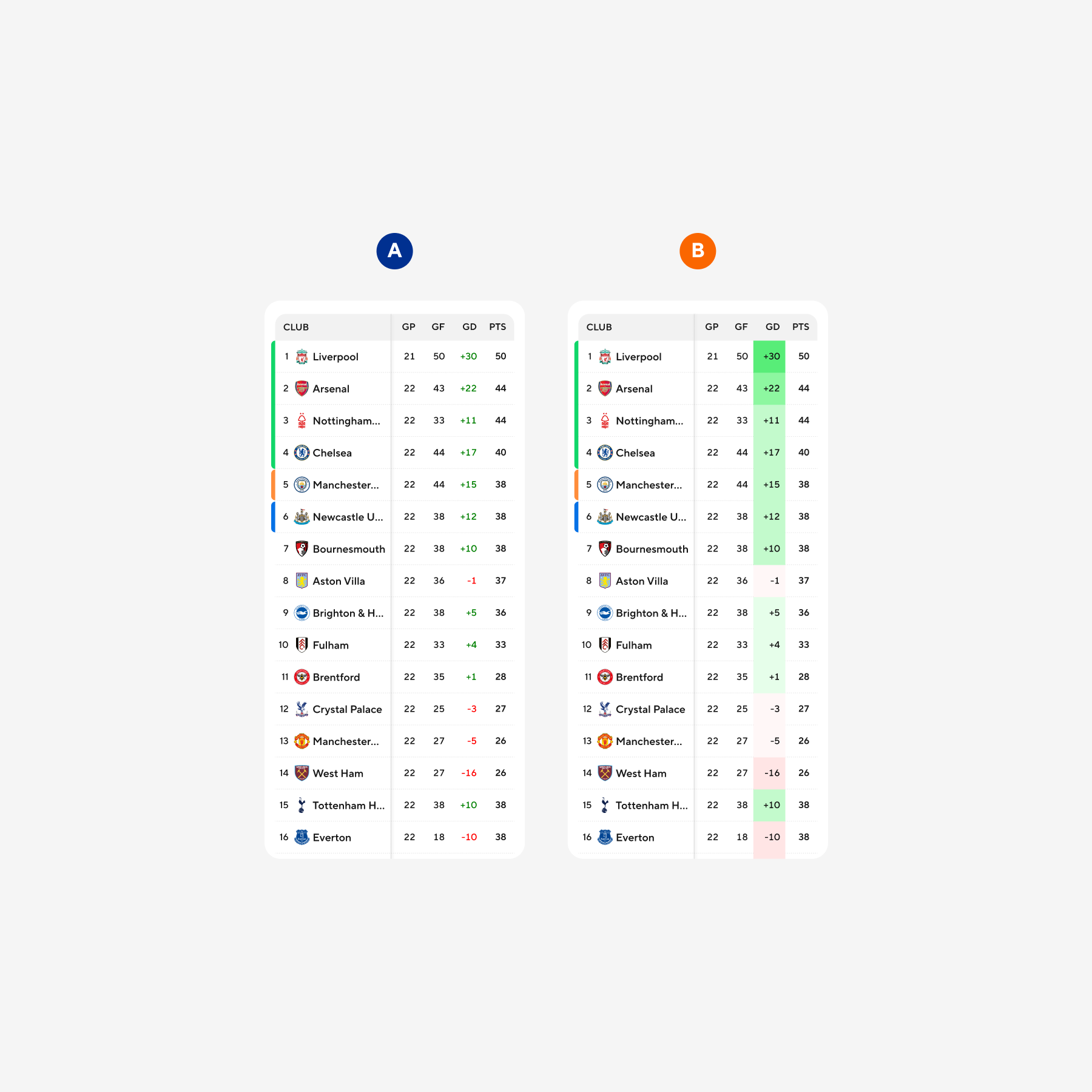
A/B Testing: Tables
User and internal feedback shaped how numerical data is structured, ensuring box scores and stats remain legible, scannable, and emotionally engaging.
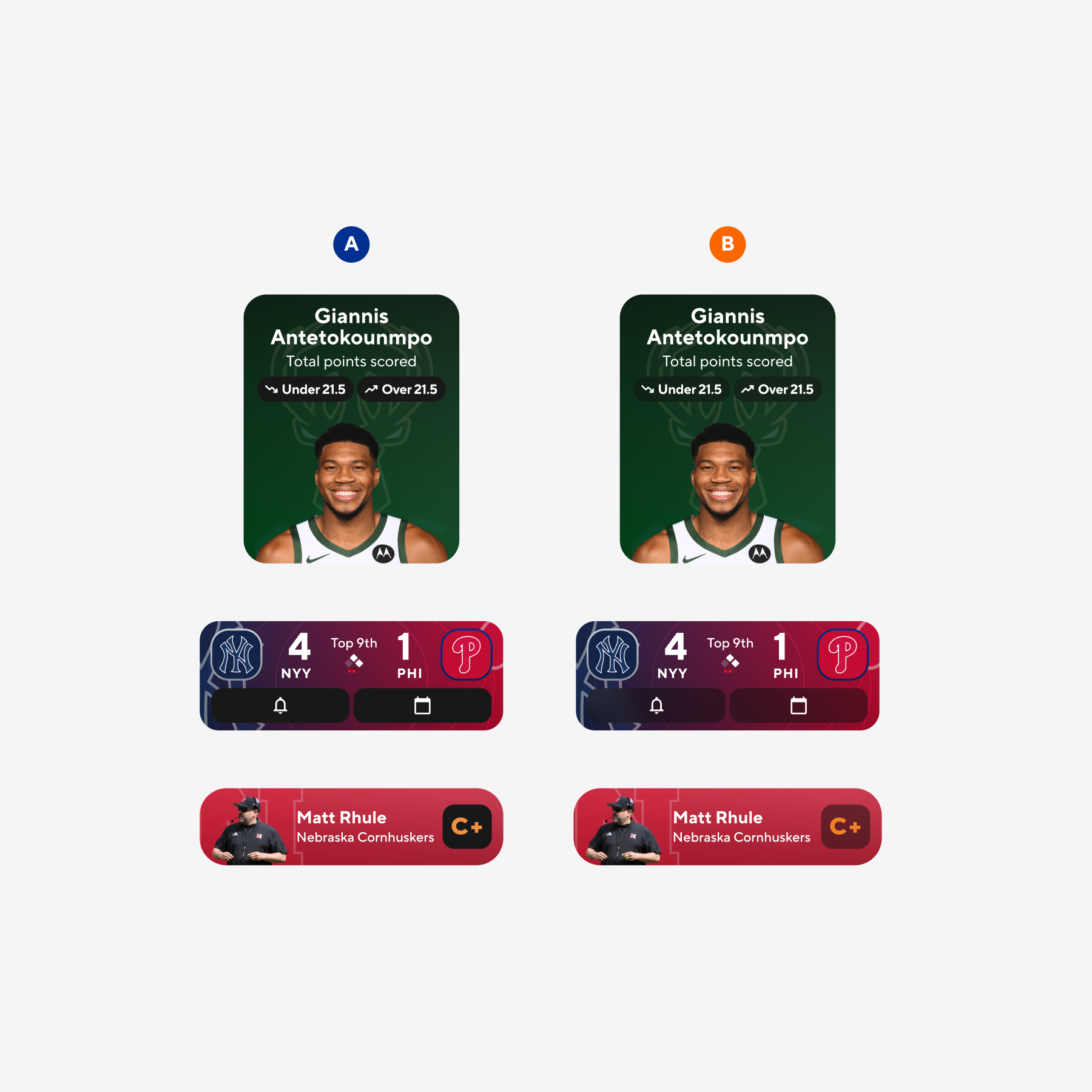
Transparency & Blur Tests
With accessibility in mind, we tested variations of transparency and background blur to find a treatment that protects legibility without sacrificing energy.
Component Explorations I
Initial component boards examined vibrancy, motion, and visual density to define how expressive the system could be without overwhelming the UI.
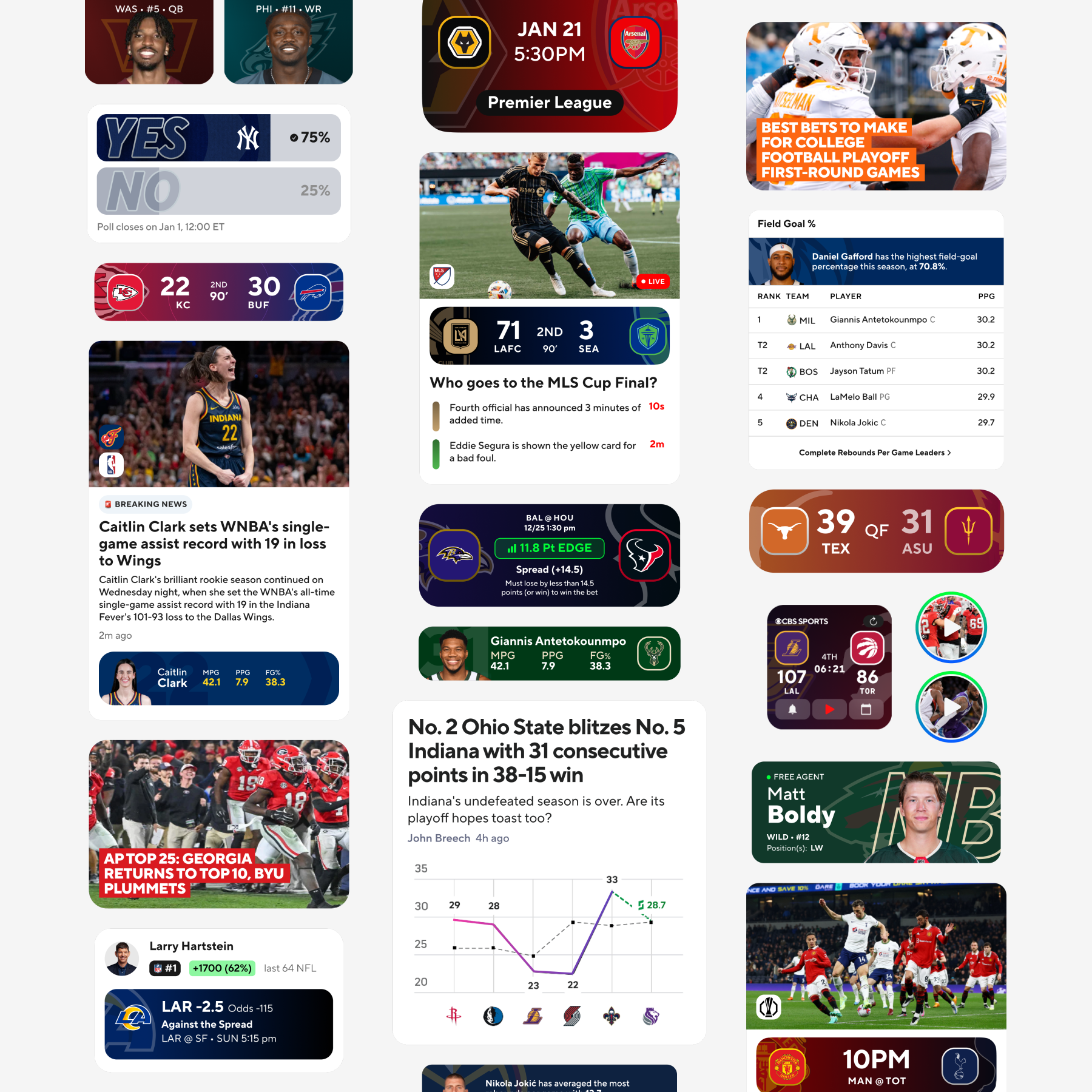
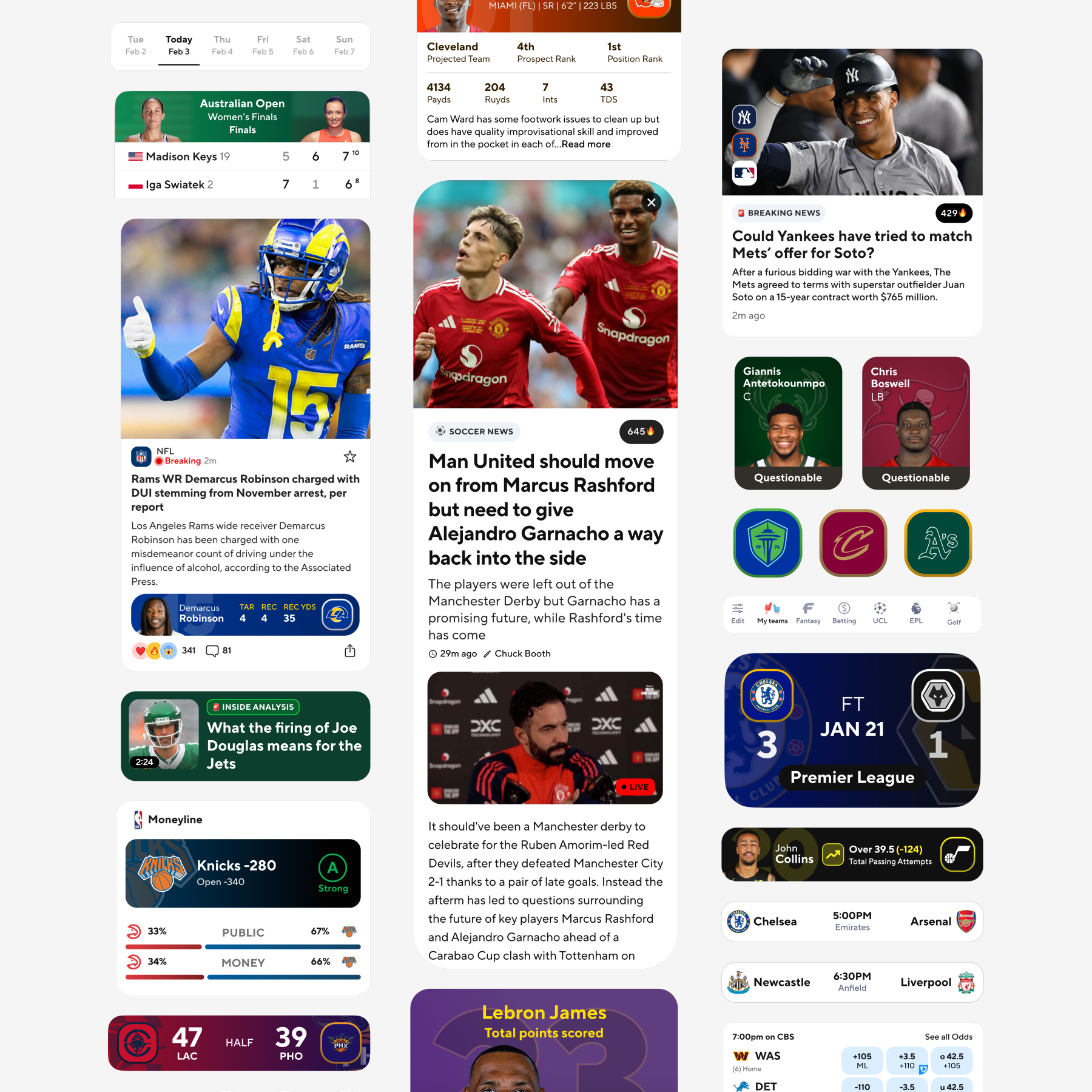
Component Explorations II
Broader compositions combined data visualizations, stats, articles, and tables — validating whether the system spoke one coherent visual language.
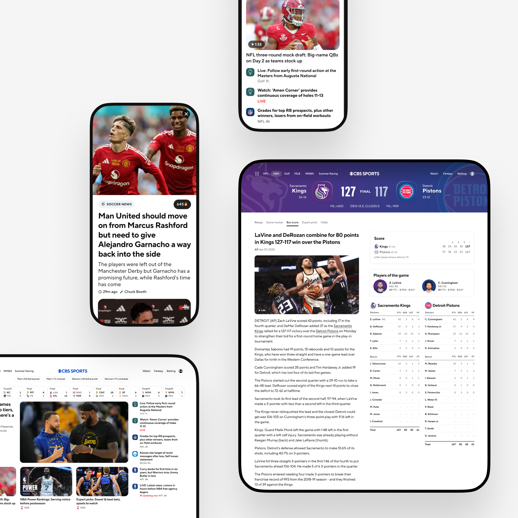
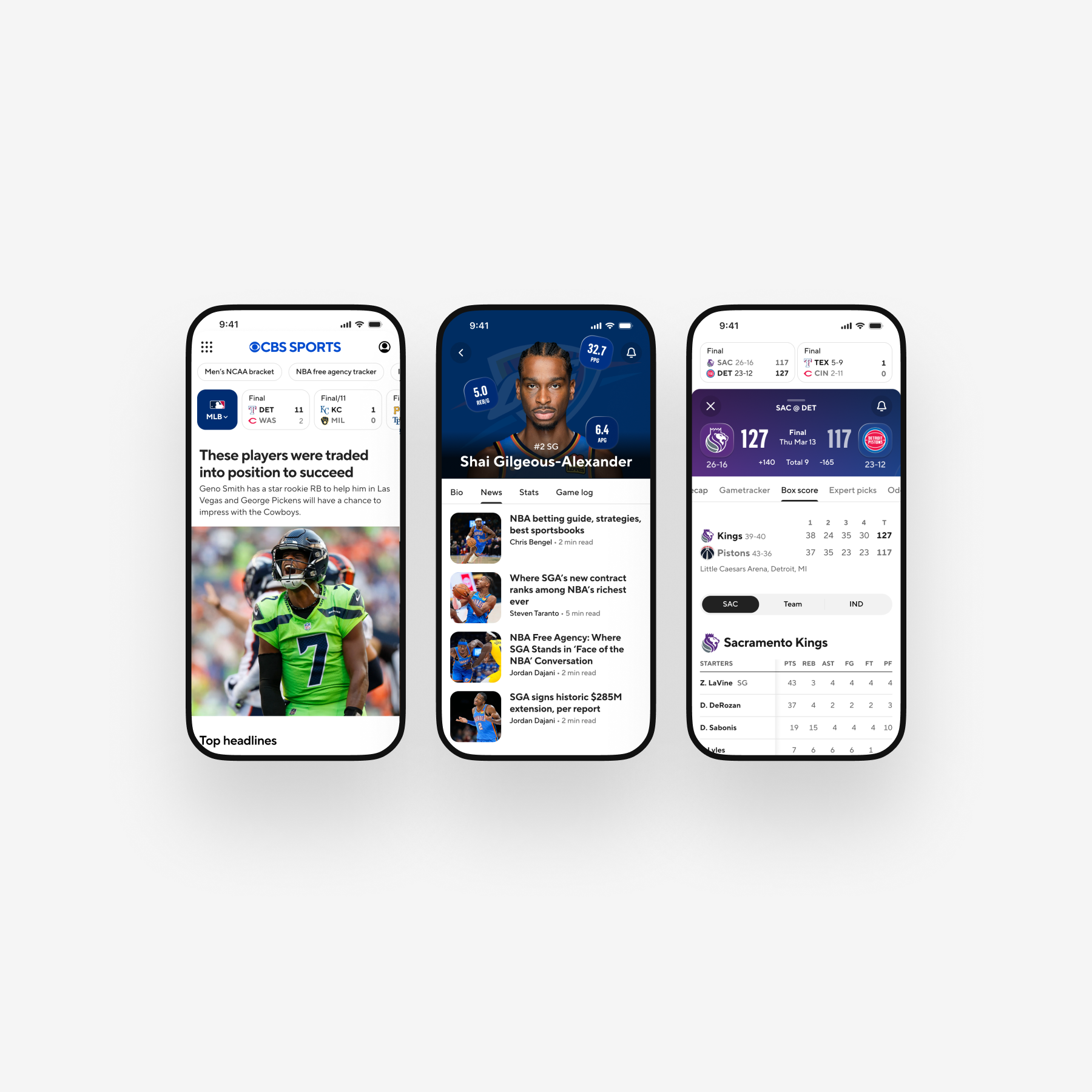
A Unified Experience Across Platforms
With the foundations defined, the system was applied across core CBS Sports experiences on mobile, web, and CTV to validate flexibility and implementation feasibility.
Every surface required its own interpretation:
→Mobile demanded immediacy and clarity in tight spaces.
→Web required breathable layouts balanced with dense scoreboards and standings.
→CTV relied heavily on motion, large-scale type, and distance legibility.
The system documented how each surface should interpret the same design logic, reducing the need to reinvent interaction behavior per platform.
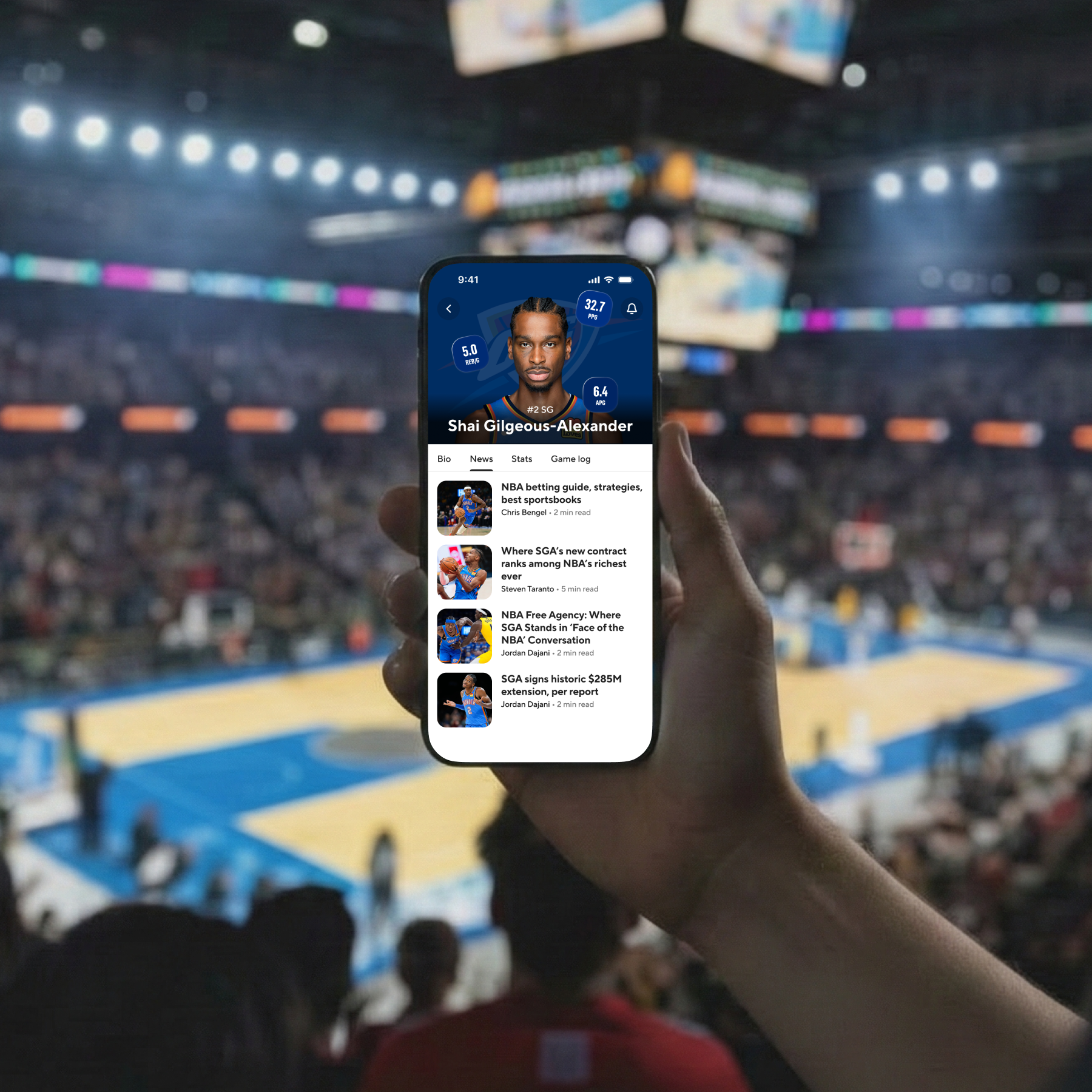
Player Profile — Mobile
A player-first layout that maximizes fandom energy using bold team colors, clean hierarchy, and minimal dividers to reduce noise.
Tablet & Mobile Score Experience
Immersive score headers and team-driven backgrounds create a vivid, emotional entry point, while articles incorporate "signs of life" inspired by social interaction patterns.
Mobile Layout Studies
Strategic use of contrast and spacing highlights what matters most — players, teams, and key stats — while reducing friction and visual clutter.
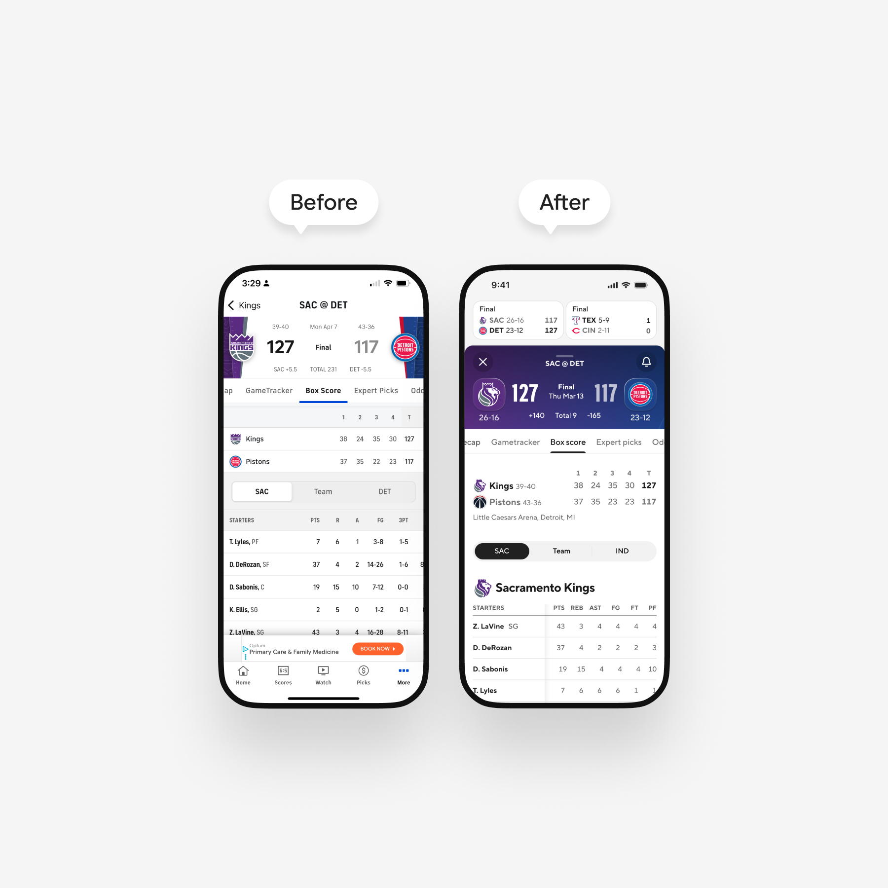
From Utility to Immersion
A before-and-after look at the mobile game tracker shows the shift from a divider-heavy, neutral layout to an immersive game HUD — using team color, hierarchy, and space to improve scanability and amplify live momentum.
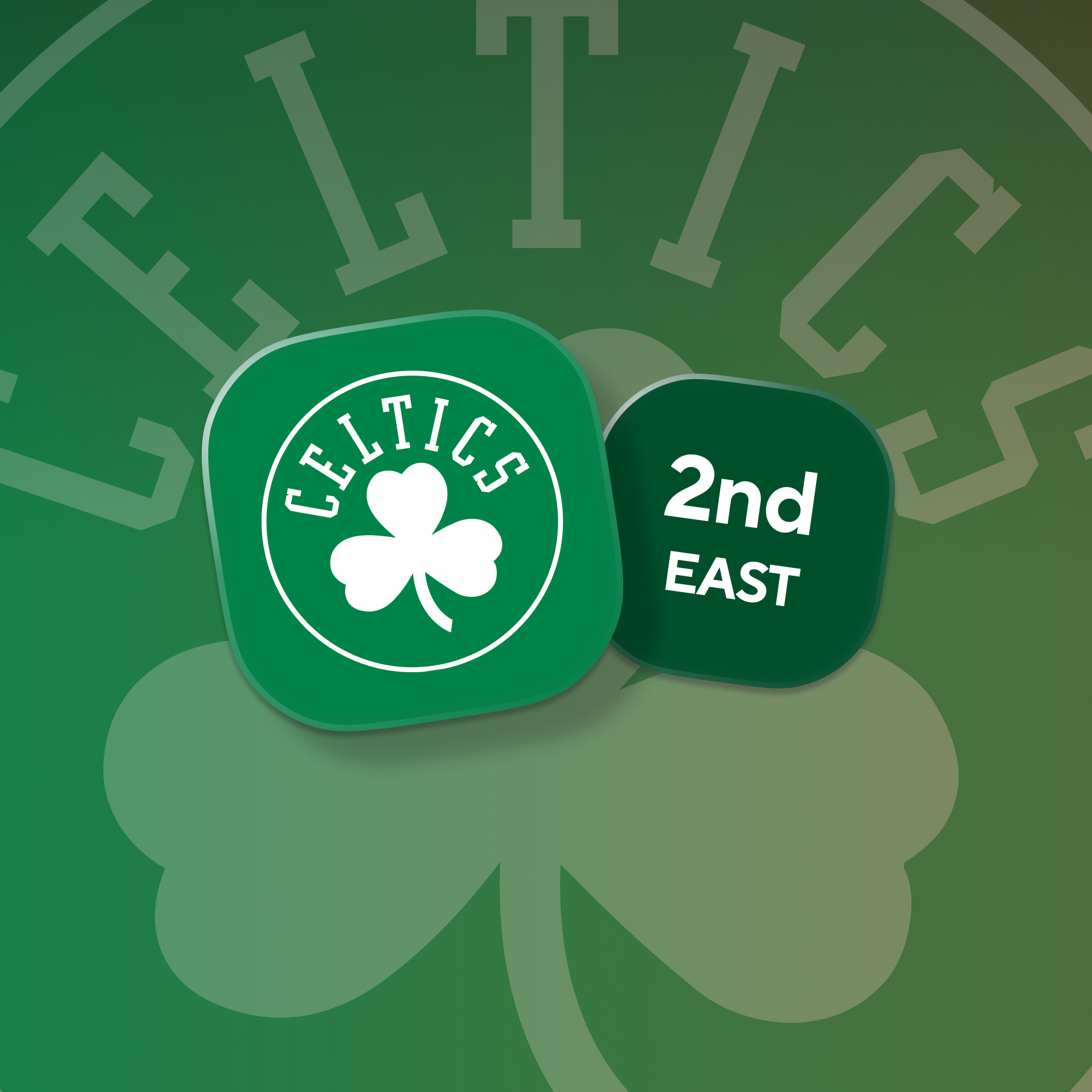
Team Badges
Expanded team marks explore color, shape, and tactility to reinforce identity and deepen fan connection.
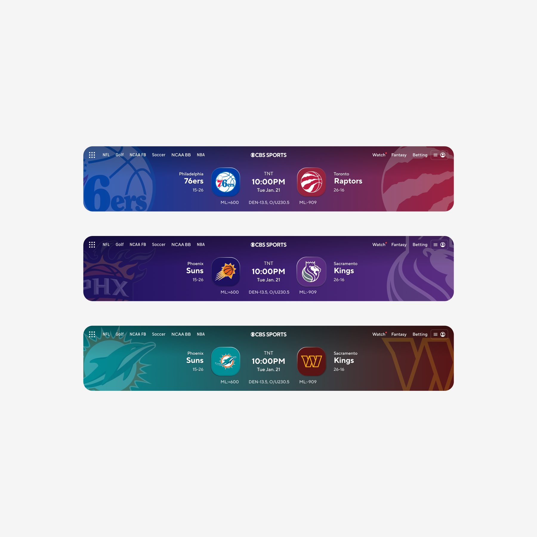
Matchup Headers
Vibrant gradients and sculpted team badges turn key moments into immersive fan experiences that feel bold and event-driven.
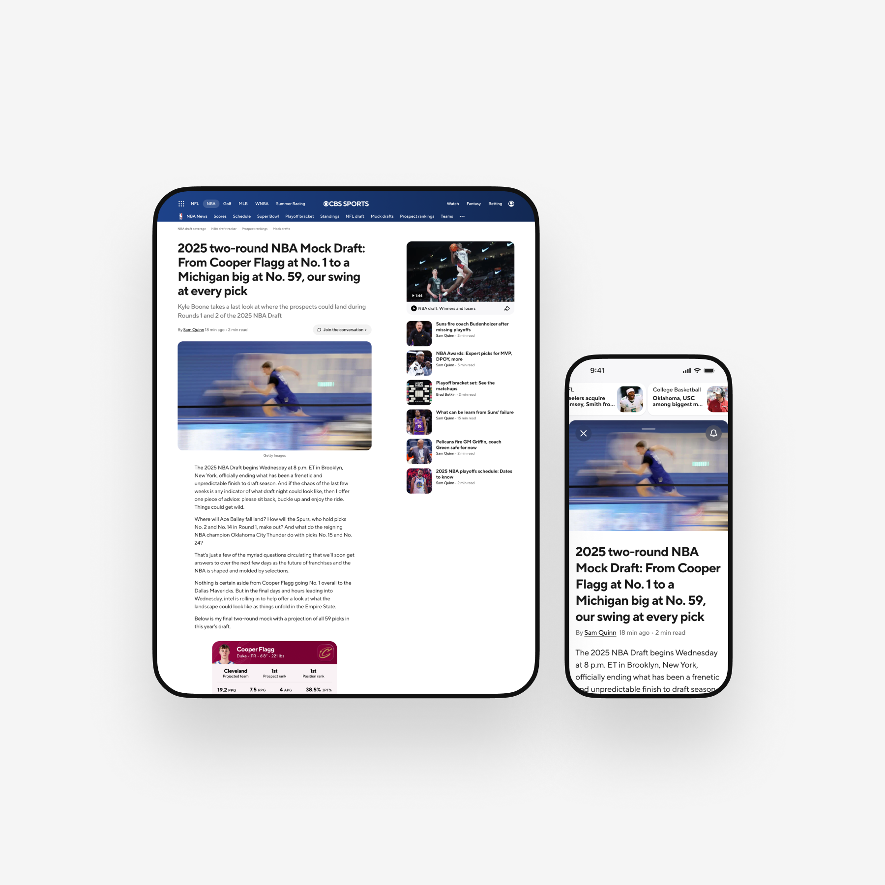
Article Experience — Tablet & Mobile
A clean, scannable structure with full-bleed imagery and a sliding video drawer offers an intuitive, immediate way to dive deeper into coverage.
Refined Components
Dynamic, team-colored elements surface player updates and live moments, enhancing clarity while amplifying energy.
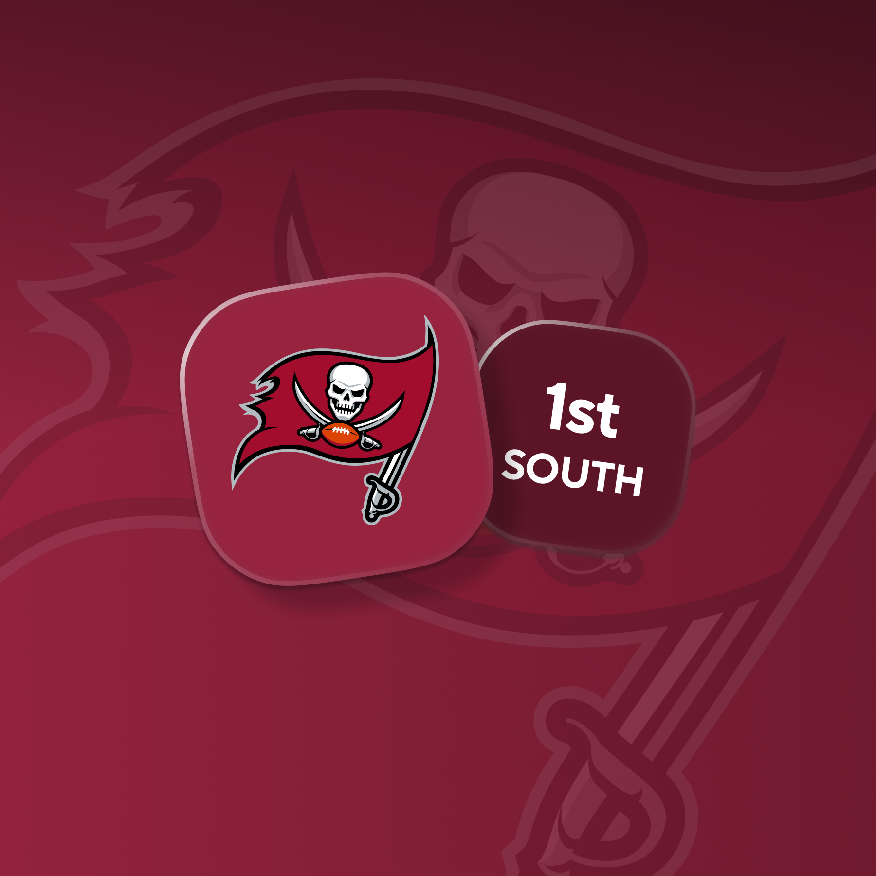
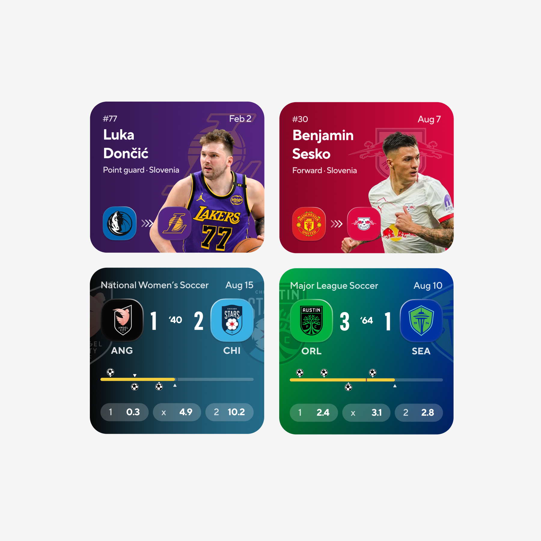
Tournament Results & Badges
Consistent use of strong team colors and expressive elements makes leagues, tournaments, and standings instantly recognizable.
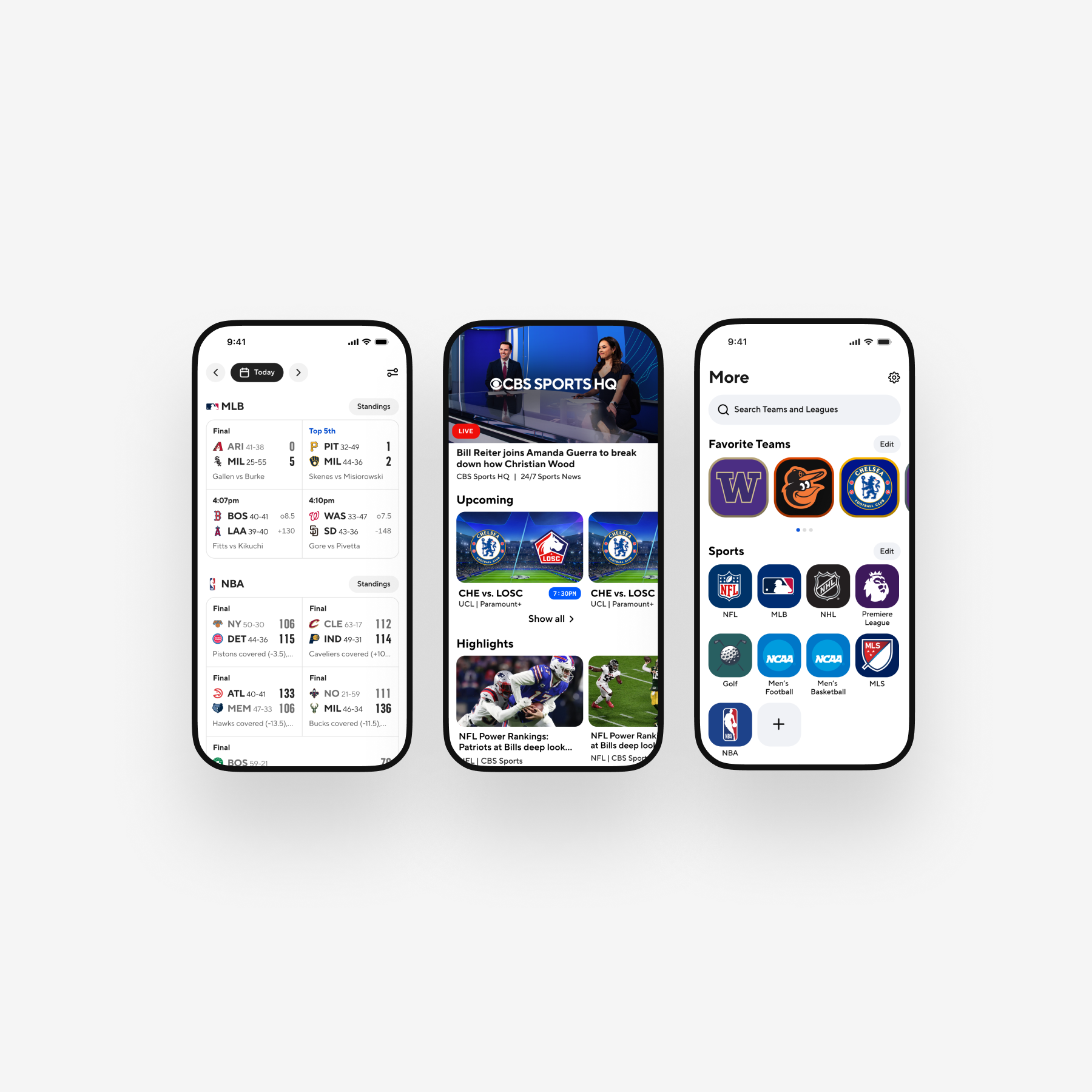
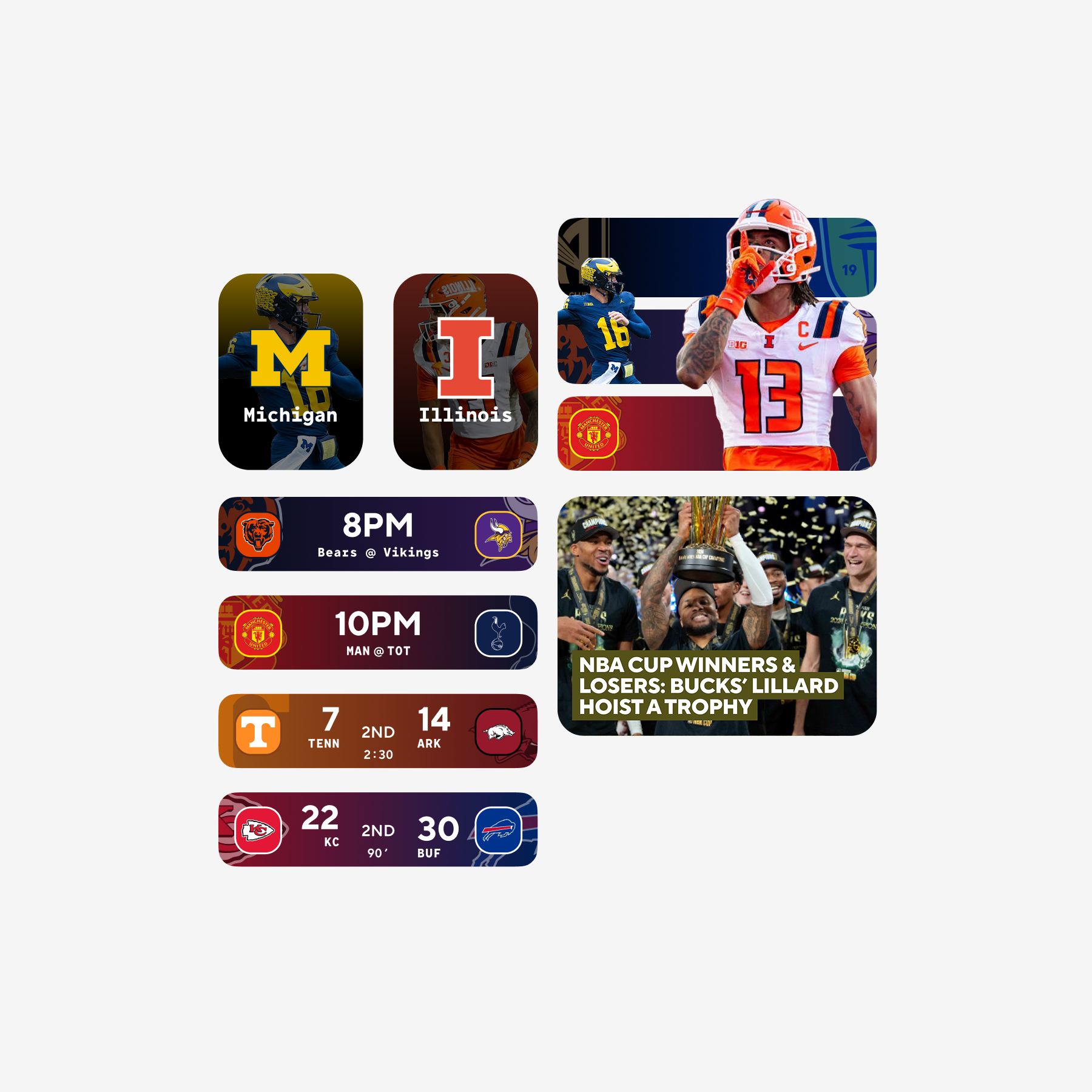
Live Scores, Video, and Personalization on Mobile
A unified mobile experience brings today's games, live and on-demand video, and team preferences into a single, fast-scanning flow — helping fans stay connected to what matters most, in real time.
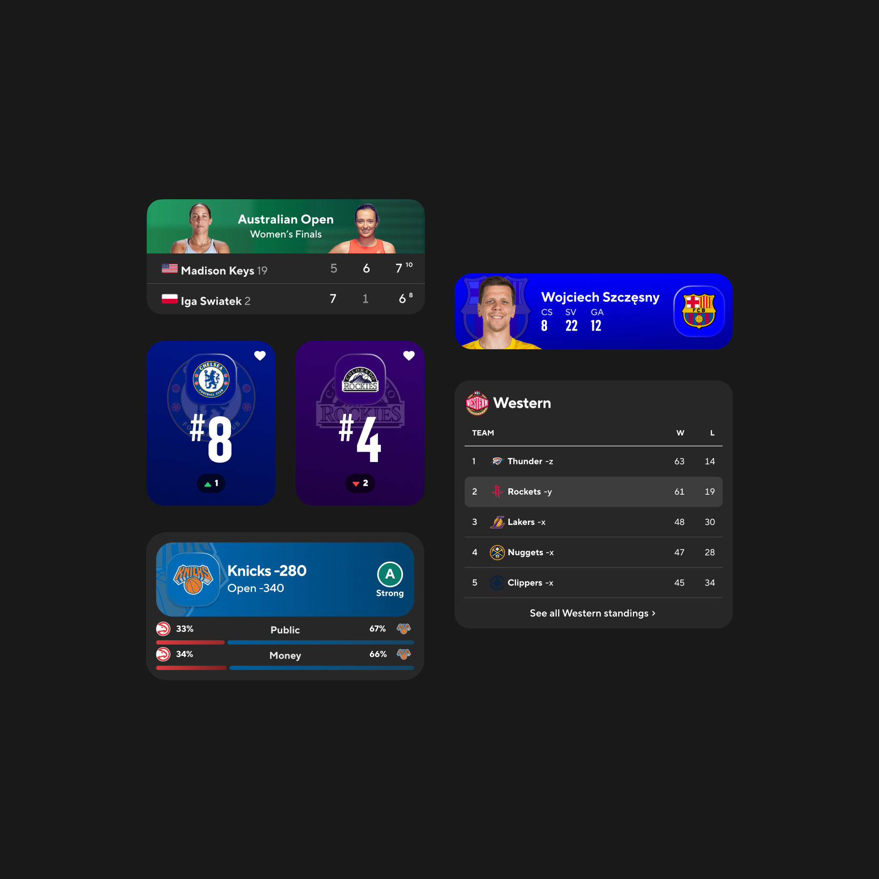
Dark Mode Components
Scores, stats, tables, and betting recommendations adapt seamlessly to dark mode, maintaining clarity, hierarchy, and vibrancy.
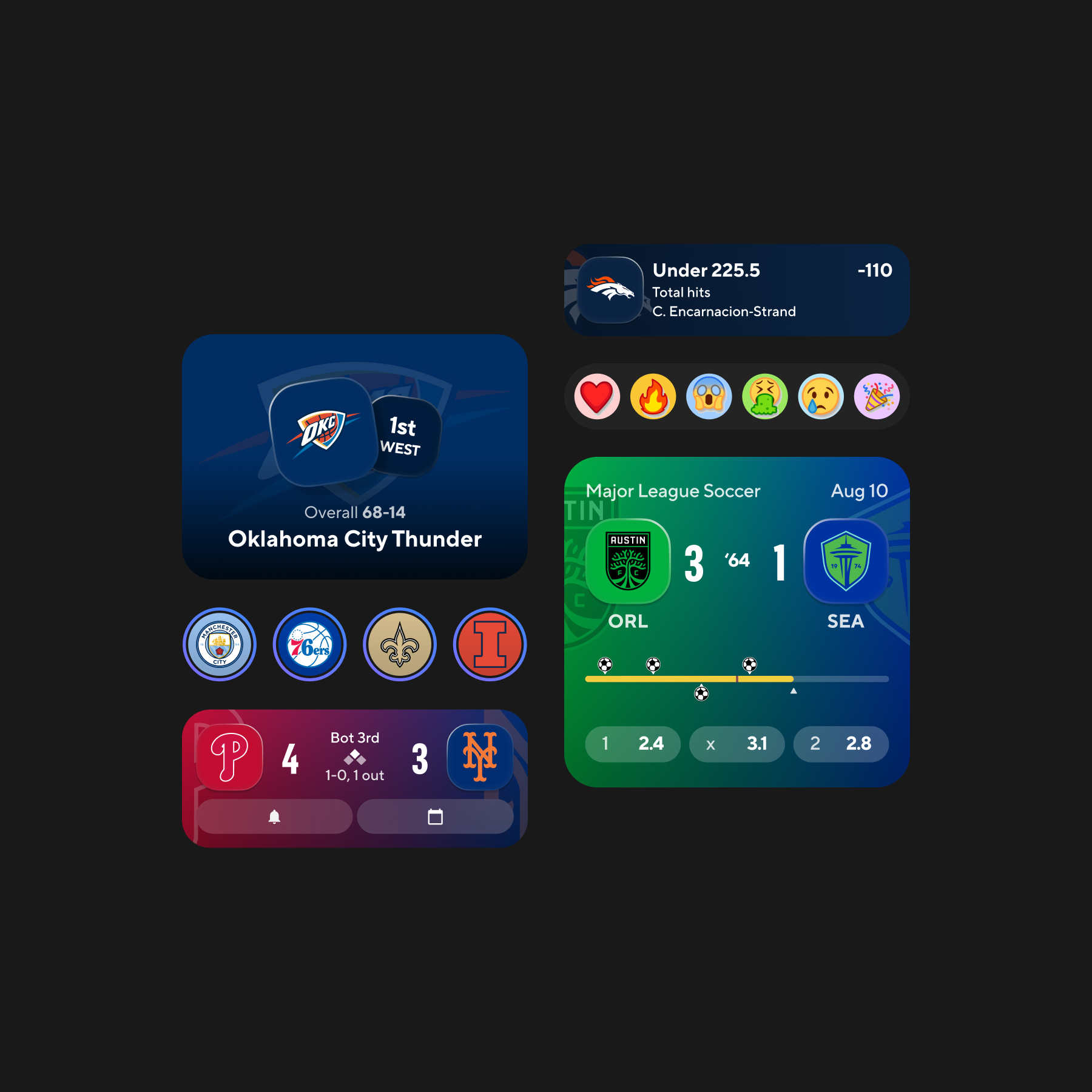
Key Components in Dark Mode
Selected Vanguard components shown in dark mode — including betting recommendations, soccer game tracking, game reminders, and social reactions — illustrating how the system maintains clarity, hierarchy, and brand expression across themes.
Outcomes
→Consolidated competing patterns into a shared interaction model across Sports surfaces
→Improved cross-platform visual and behavioral consistency
→Reduced recurring pattern debates during feature design
→Delivered implementation-ready components and motion guidelines
→Created a scalable foundation for future expansion
Reflection
Vanguard represents one of the most impactful design initiatives I've led — a year-long partnership across design, engineering, and product leadership.
The project demonstrated how shared patterns can support both expressive design and cross-platform consistency. Most importantly, it shifted conversations from individual screens to reusable interaction decisions.
System Stage
Vanguard established the interaction model and reusable component logic for CBS Sports. Broader cross-brand rollout was explored but not part of my direct ownership. My role focused on defining the system, validating it across platforms, and preparing it for implementation.